


CI / BI
Green Maker that creates beautiful future
-
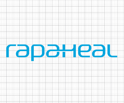
- Word MARK
- Rapaheal is a mask specialty brand that can meet both safety, reliability and quality. Rapaheal incorporates bnk's corporate philosophy of pursuing environmentally friendly environmental management and offers only customer-friendly products.
- Lowercase wordmarks that are familiar and easy to reach customers Customer-oriented It brings the value of human-centered Rapaheal and the health of our customers' lives, and incorporates the healing concept into the breath of nature.
-
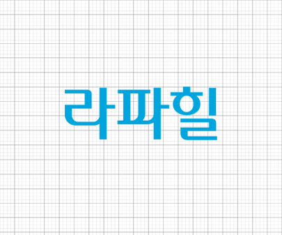
- Logo type Kr.
- The logotype is used to indicate the official name of Rapaheal.
- The national logotype was created in consideration of harmony with the word mark and should not be used in any modification. For a consistent image, the data described in this instruction manual must be used at the time of production.
-
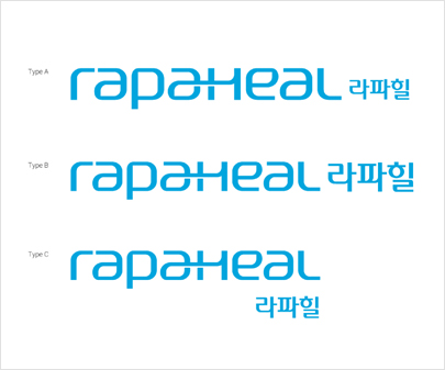
- Signature
- Rapaheal's word mark is used preferentially, and when used with the national logotype as needed, it was manufactured in consideration of the harmony of the word mark in the position regulation, so it should be randomly transformed and modified before use. It doesn't become.
-
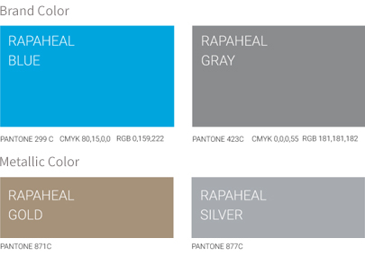
- Color
- The color has been selected to effectively deliver rapaheal’s corporate image. Other color may be used upon the characteristics of applied media. PANTONE color provided upon print must be complied. When applied for media other than printouts, please pay close attention to maintain the optimal condition closest to the guided color
-
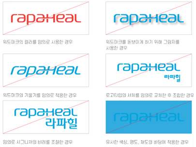
- User warning
- When the shape is changed at will, the original image is damage. Therefore, standard shape must be used. User manual described here must be complied in order to deliver bnk’s image in correct manner.
